
County 2 County
Up today: a brief little mapping exercise in leaflet for R, combined with htmlwidget’s saveWidget function that allows users to create a simple map in leaflet, compile it to HTML and upload onto the web.
The topic of the map is the ACS County-to-County migration models, specifically filtered to show migration to the Seattle, Portland, and San Francisco regions. More specifically, it filters the data to only show counties where there was migration to at least one of those destinations. I also wanted to use the very cool “tricolore” package that allows you to create ternary choropleth maps that can depict relative proportions of three different variables (in this case, the percentages of migrants moving to the three different metros).
Generally it takes people a minute to break down what they’re looking at when you make a ternary choropleth. Putting a ternary legend in a leaflet webmap is kinda hacky and I don’t really like the mechanics (or the look, really) of it, so I’d rather, for the purposes of this post, just stick it outside where you can gander at it while you click around the webmap.
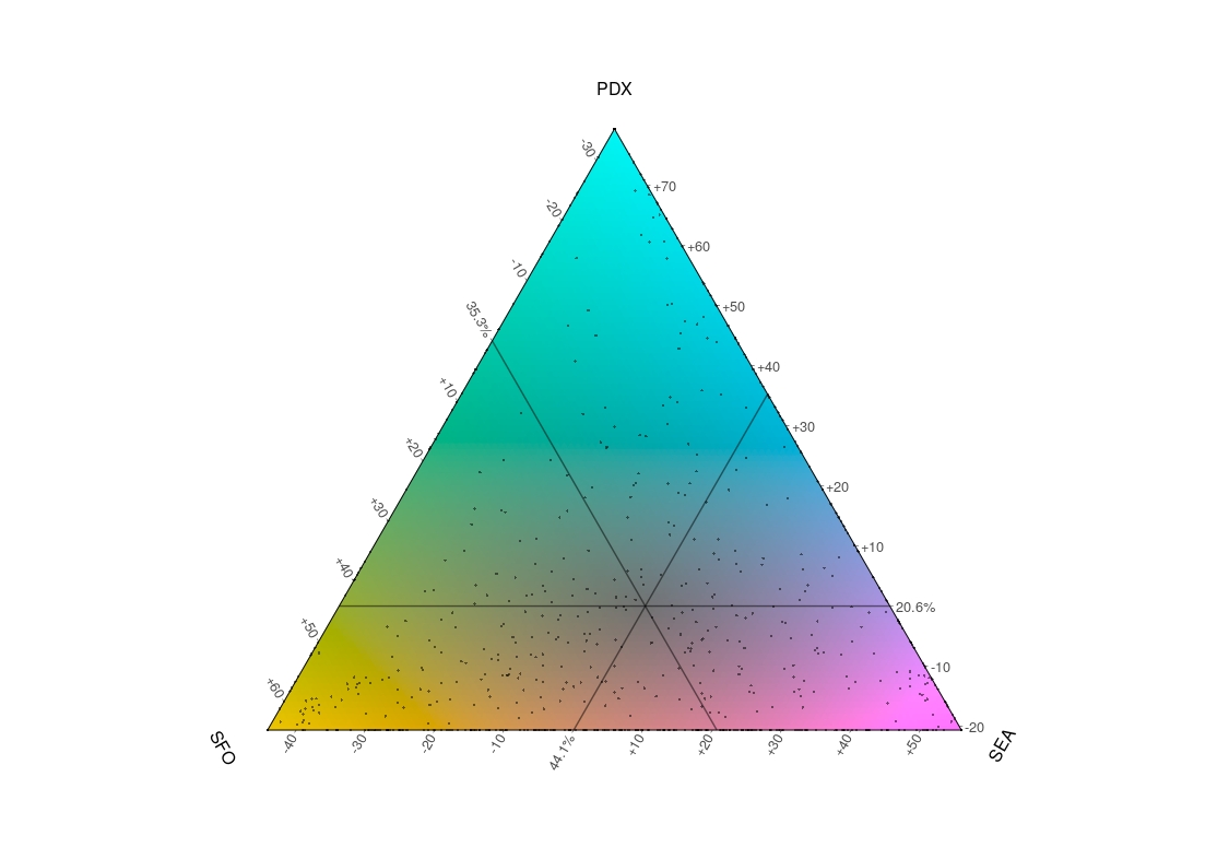
The converging lines, in this case, intersect over the average center of the data. This translates roughly to saying that in the average county, the share of migrants was about 20% to Portland, 35% to San Francisco, and 45% to Seattle. Keeping in mind that this is the 5-year ACS data feeding into this map, which means that we’re looking at essentially aggregate migration over that time period, as captured in surveys. So, that means take it as an interesting but not necessarily accurate depiction of broad trends over mutliple years.